
- What Makes Ecommerce Web Design Different from Other Websites
- Core Ecommerce Design Principles That Drive Sales
- How to Design an Effective Ecommerce Homepage
- Best Practices for Ecommerce Product Page Design
- Mobile Ecommerce Design Essentials
- Ecommerce UX Design Mistakes to Avoid
- Ecommerce Website Layout Comparison
When a visitor lands on your online store, you have roughly three seconds to convince them to stay. The design choices you make—from button placement to image quality—directly influence whether that visitor becomes a paying customer or bounces to a competitor’s site.
Ecommerce website design isn’t just about aesthetics. It’s a strategic blend of psychology, usability, and technical performance that guides shoppers from browsing to checkout. A well-designed store anticipates customer needs, removes friction, and builds trust at every interaction point.
This guide breaks down proven design strategies that increase conversions, reduce cart abandonment, and create shopping experiences customers want to return to.
What Makes Ecommerce Web Design Different from Other Websites
Unlike blogs or corporate sites that focus on information delivery, ecommerce platforms must accomplish multiple objectives simultaneously. Every page needs to inform, persuade, and facilitate transactions while managing hundreds or thousands of product listings.
The conversion funnel dictates design priorities. A typical ecommerce web design must seamlessly transition users from discovery (homepage or category pages) through evaluation (product pages) to transaction (checkout). Each stage requires different design elements and psychological triggers.
Product catalogs introduce complexity that other websites don’t face. You need filtering systems, comparison tools, and navigation that works whether you sell 50 items or 50,000. The architecture must scale without overwhelming users with choices—a phenomenon psychologists call decision paralysis.
Trust signals become critical when asking strangers to share credit card information. Security badges, customer reviews, clear return policies, and professional photography aren’t optional decorative elements. They’re functional components that directly impact conversion rates. Studies from the Baymard Institute show that 18% of US shoppers abandon carts due to trust concerns about payment security.
Checkout flows represent another unique challenge. While most websites consider a form submission a success, ecommerce sites must minimize every possible friction point during payment. A single unnecessary field or confusing error message can cost you a sale.
The technical requirements also differ. Inventory management systems, payment gateways, shipping calculators, and tax engines must integrate smoothly without disrupting the user experience. Your design needs to accommodate these backend complexities while presenting a simple, intuitive interface.
Core Ecommerce Design Principles That Drive Sales
Visual hierarchy determines what customers notice first. The human eye follows predictable patterns—typically starting at the top left and moving in an F or Z pattern across the page. Strategic ecommerce design principles leverage this behavior by placing high-priority elements like calls-to-action and value propositions in these hot zones.
Size, color, and whitespace create emphasis. Your “Add to Cart” button should visually dominate other page elements without looking garish. Contrast draws attention—a bright button on a neutral background outperforms a same-color scheme. But restraint matters; if everything screams for attention, nothing stands out.
Simplicity reduces cognitive load. Each additional element on a page—whether a banner, popup, or sidebar widget—competes for mental resources. Amazon’s product pages, despite their clutter reputation, actually follow strict hierarchy rules: product title, price, availability, and add-to-cart appear in consistent positions across millions of listings.
Consistency builds familiarity and trust. When navigation, buttons, and layouts behave predictably across pages, shoppers develop mental models of how your store works. Changing button colors or moving the cart icon between pages forces users to relearn the interface, creating unnecessary friction.
Mobile-first design isn’t optional anymore. Over 60% of ecommerce traffic comes from mobile devices in 2026. Designing for small screens first forces you to prioritize essential elements, then progressively enhance for larger displays. This approach prevents the common mistake of cramming desktop features onto mobile screens.
Loading speed directly impacts revenue. Google research indicates that 53% of mobile users abandon sites taking longer than three seconds to load. Each additional second of load time can decrease conversions by 7%. Compress images, minimize JavaScript, use lazy loading, and leverage browser caching. A beautiful design that loads slowly converts worse than a plain design that loads instantly.
Accessibility expands your market and improves usability for everyone. Color contrast ratios, keyboard navigation, screen reader compatibility, and clear focus indicators help users with disabilities—but they also benefit shoppers in bright sunlight, users with temporary injuries, and anyone navigating with a keyboard.
How to Design an Effective Ecommerce Homepage
Your homepage serves as a filter, not a catalog. The goal isn’t displaying every product but directing different customer segments to relevant sections quickly. Think of it as a well-organized department store entrance, not a warehouse.
Hero sections should communicate your unique value proposition within seconds. “Free shipping on orders over $50” or “Handcrafted furniture made in Oregon” tells visitors immediately whether they’re in the right place. Generic statements like “Quality products at great prices” waste valuable real estate. Pair your message with imagery that reinforces your brand positioning—lifestyle photography for aspirational brands, clean product shots for minimalist stores.
Category navigation needs visibility and clarity. Whether you use a mega menu, sidebar, or tile-based layout depends on your catalog size. Stores with fewer than 50 products can use simple top navigation. Larger catalogs benefit from mega menus that reveal subcategories on hover. Fashion retailer ASOS uses category tiles with lifestyle images—an ecommerce homepage design approach that combines navigation with brand storytelling.
Featured products or collections serve different purposes. “New arrivals” attract repeat visitors, “bestsellers” leverage social proof, and “sale items” convert price-sensitive shoppers. Rotate these sections based on seasonality, inventory levels, and business goals. A ski shop in July should feature different products than in December.
Search functionality deserves prominent placement—typically in the header. About 30% of visitors use site search, and these searchers convert at 2-3 times the rate of non-searchers. Ensure the search bar is visible on mobile without requiring a tap to reveal it. Autocomplete suggestions help users find products faster and expose them to items they might not have known you carried.
Trust badges and social proof belong above the fold. Security seals, payment icons, review ratings, and media mentions reduce perceived risk. But don’t overdo it—five well-chosen trust signals outperform twenty scattered logos that look desperate.
The ecommerce website layout should guide eyes naturally from value proposition to category exploration to featured products. Use whitespace to create visual breathing room. Crowded homepages overwhelm; spacious designs feel premium and easier to navigate.

Best Practices for Ecommerce Product Page Design
Product pages carry the heaviest conversion burden. Visitors arrive with intent—they’re evaluating whether to buy. Your design must answer every question and overcome every objection without requiring them to leave the page.
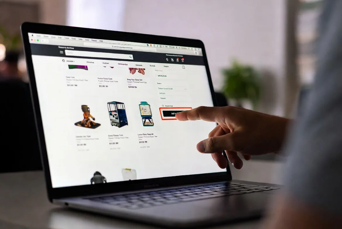
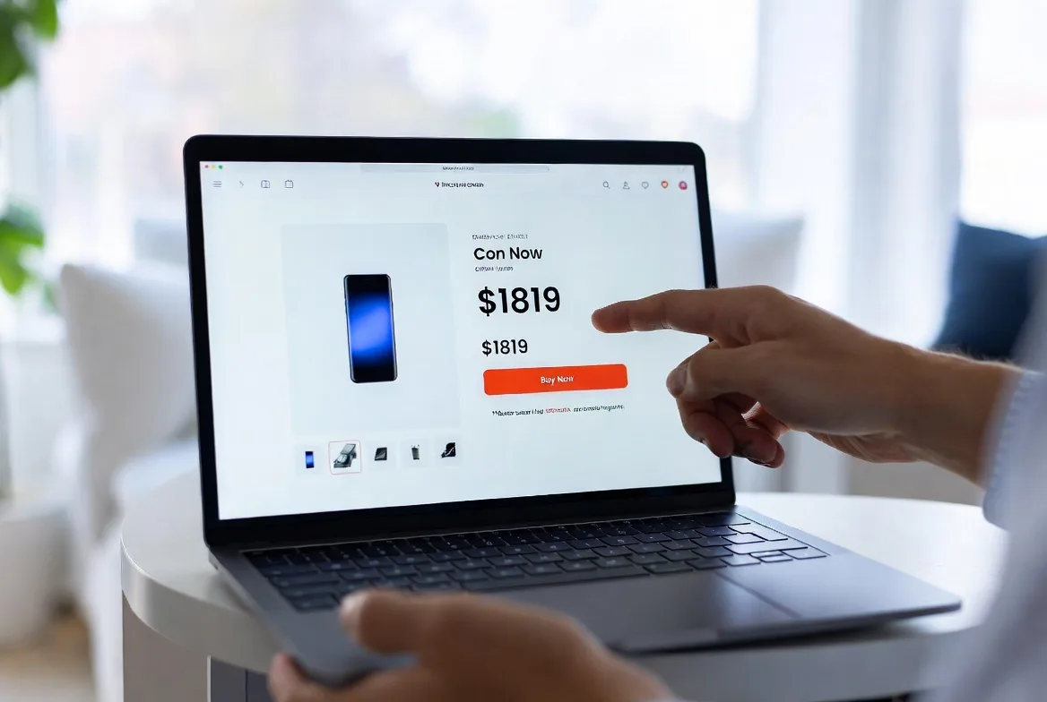
Above-the-fold real estate should include the product image, title, price, primary CTA, and availability status. Shoppers shouldn’t scroll to find basic information or the purchase button. Place secondary actions like “Add to Wishlist” or “Find in Store” nearby but visually subordinate to the main CTA.
Breadcrumb navigation serves two purposes: it helps users understand where they are in your catalog hierarchy, and it provides an easy escape route if the product isn’t quite right. “Home > Women’s Clothing > Dresses > Summer Dresses” lets visitors backtrack to browse similar items.
Customer reviews deserve prominent placement. Display the star rating near the product title, then provide detailed reviews further down the page. Reviews answer questions, provide social proof, and generate fresh content that search engines love. The best ecommerce website design treats reviews as conversion tools, not afterthoughts.
Related products and cross-sells appear at strategic points. “Customers also viewed” helps indecisive shoppers explore alternatives. “Frequently bought together” increases average order value. Place these sections after the main product information to avoid distraction, but before reviews to catch users who scroll past the initial content.
Product Image Guidelines
Images sell products online more than any other element. Shoppers can’t touch or try items, so photography must compensate for the sensory gap.
Multiple angles are non-negotiable. Front, back, side, and detail shots let customers examine products thoroughly. Clothing should show the item on a model and as a flat lay. Furniture needs room context shots alongside isolated product images.
Zoom functionality reveals quality and detail. High-resolution images that support 2x or 3x zoom let shoppers inspect stitching, texture, and finish. This feature particularly matters for premium products where quality justifies the price.
Consistent styling creates professional cohesion. White backgrounds work for most product categories because they eliminate distractions and make items pop. Lifestyle images add context but should supplement, not replace, clean product shots.
Image optimization balances quality and performance. Use modern formats like WebP that compress better than JPEG. Implement lazy loading so images load as users scroll. A 2MB product image might look stunning, but it kills mobile performance—aim for under 200KB per image without visible quality loss.
Writing Product Descriptions That Convert
Product descriptions should inform and persuade simultaneously. Specifications matter, but so does emotional appeal.
Lead with benefits, not features. “Keeps coffee hot for 6 hours” resonates more than “Double-wall vacuum insulation.” Translate technical specs into practical outcomes that match customer goals.
Structure for scanability. Most visitors skim rather than read. Use short paragraphs, bullet points for key features, and bold text for important details. Frontload critical information—material, dimensions, care instructions—before diving into marketing copy.
Address objections proactively. If customers frequently ask about sizing, include a size chart and fit notes. If durability is a concern, mention warranty details and material quality. Anticipating questions reduces support tickets and abandoned carts.
Use sensory language that compensates for physical absence. Describe texture (“buttery-soft leather”), sound (“whisper-quiet motor”), or scent (“subtle vanilla notes”) when relevant. Help shoppers imagine the product experience.
Match your tone to your audience. Technical specs suit B2B buyers; storytelling works for lifestyle brands. A company selling industrial equipment should write differently than one selling artisan candles.
Mobile Ecommerce Design Essentials
Mobile ecommerce design requires rethinking, not just resizing. Constraints of small screens, touch interfaces, and variable connectivity demand different approaches than desktop design.
Responsive layouts adapt to screen sizes, but mobile-first thinking prioritizes content differently. Stack elements vertically, use full-width buttons for easy tapping, and minimize horizontal scrolling. Navigation that works perfectly on desktop often fails on mobile—hamburger menus hide options but save screen space, while persistent bottom navigation bars keep key functions accessible.
Thumb-friendly design acknowledges how people actually hold phones. The bottom third of the screen is easiest to reach with one-handed use. Place primary actions—add to cart, checkout, search—in this zone. Top corners require hand repositioning and are prime locations for secondary functions like account access.
Simplified checkout reduces mobile cart abandonment, which runs about 85% compared to 70% on desktop. Minimize form fields, offer autofill, and support digital wallets like Apple Pay and Google Pay that complete purchases with a fingerprint or face scan. Multi-step checkouts work better on mobile than single-page forms because they feel less overwhelming on small screens.
Mobile payment options should include more than credit cards. Digital wallets, buy-now-pay-later services like Affirm or Klarna, and even PayPal can increase conversion by meeting customers where they are. Each additional payment method captures shoppers who might have abandoned otherwise.
Performance optimization matters even more on mobile. Cellular connections are slower and less reliable than WiFi. Compress images aggressively, minimize third-party scripts, and use accelerated mobile pages (AMP) for content-heavy pages. Test on actual devices, not just browser emulators—a site that feels snappy on your office WiFi might crawl on a 4G connection.
Sticky headers and footers keep navigation accessible without scrolling, but they consume precious screen space. If you use them, keep them minimal—a search icon, cart, and menu button at most.

Ecommerce UX Design Mistakes to Avoid
Complex navigation buries products under too many categories and subcategories. If customers need four clicks to reach a product, you’ve lost many of them. Flatten your hierarchy when possible. Mega menus help, but only if organized logically—alphabetical category lists force users to hunt rather than browse intuitively.
Poor search functionality frustrates high-intent visitors. Search should handle misspellings, synonyms, and product variations. A customer searching “sneakers” should see results even if you’ve categorized them as “athletic shoes.” Filters for price, size, color, and other attributes help narrow results. Zero-result pages should suggest alternatives rather than dead-ending.
Hidden costs destroy trust. Surprising customers with shipping fees, taxes, or handling charges at checkout triggers abandonment. Display full costs early—ideally on product pages, definitely before the payment step. Free shipping thresholds work because they’re transparent: “Add $15 more for free shipping” gives customers control.
Forced account creation adds friction that many shoppers won’t tolerate. Guest checkout should always be an option. You can encourage account creation after purchase completion when customers are already satisfied. The ecommerce ux design principle here is simple: remove every non-essential barrier between the customer and the purchase button.
Slow load times have been mentioned, but they deserve emphasis. Users blame slow sites on poor quality or unreliability. If your homepage takes eight seconds to load, customers assume the entire shopping experience will be frustrating. Prioritize performance with the same intensity you prioritize aesthetics.
Unclear calls-to-action leave visitors uncertain about next steps. Buttons should use action verbs—”Add to Cart,” “Buy Now,” “Get Started”—not vague labels like “Submit” or “Continue.” Color and size should make CTAs obvious. If users have to hunt for the purchase button, your design has failed.
Intrusive popups damage user experience, especially on mobile. Email capture popups that appear immediately, cover the entire screen, or lack clear close buttons frustrate visitors who haven’t even seen your products yet. If you must use popups, delay them until users show engagement signals—scrolling, viewing multiple pages, or spending time on site.
Poor mobile optimization shows disrespect for the majority of your traffic. Tiny text requiring zooming, buttons too small to tap accurately, and horizontal scrolling indicate a desktop design carelessly shrunk to fit mobile screens. Test on actual phones regularly.
Ecommerce Website Layout Comparison
Different layout approaches suit different product types and browsing behaviors. Here’s how the three main styles compare:
| Layout Type | Pros | Cons | Best Use Cases |
|---|---|---|---|
| Grid Layout | Clean, organized appearance; Easy to scan multiple products; Works well for image-heavy catalogs; Familiar to most users | Can feel repetitive; Limits product information visibility; May not showcase product differences well | Fashion, home decor, electronics, any visually-driven category with similar-sized products |
| List Layout | Displays more product details; Easier to compare specifications; Works better for text-heavy products; Accessible for screen readers | Takes more vertical space; Shows fewer products per screen; Can feel cluttered if poorly executed | B2B products, technical equipment, books, products requiring detailed specifications |
| Masonry Layout | Visually dynamic and engaging; Accommodates varying image sizes; Creates Pinterest-like browsing experience; Feels modern and creative | Unpredictable scanning pattern; Harder to compare products; Can slow page performance; May confuse some users | Art, photography, handmade goods, products with varying dimensions or aspect ratios |
Most successful stores use hybrid approaches—grid for category pages, list for search results, masonry for curated collections. Test different layouts with your specific audience rather than assuming one approach fits all situations.
Good design is actually a lot harder to notice than poor design, in part because good designs fit our needs so well that the design is invisible.
Don Norman
FAQs
Professional ecommerce design ranges from $5,000 for template customization to over $100,000 for fully custom builds. Template-based platforms like Shopify or BigCommerce start around $2,000-$10,000 including setup and basic customization. Custom designs for mid-sized businesses typically cost $25,000-$75,000. Enterprise solutions with advanced features, integrations, and custom functionality often exceed $100,000. Ongoing costs include hosting, maintenance, and updates—budget 15-20% of initial development costs annually.
Shopify offers the best balance of design flexibility and ease of use for most businesses, with thousands of themes and extensive customization options. WooCommerce (WordPress) provides maximum flexibility for those comfortable with code, allowing complete control over every design element. BigCommerce falls between the two, offering robust built-in features with good customization. For enterprise needs, Adobe Commerce (Magento) delivers unlimited flexibility but requires significant technical expertise. Your choice should match your technical capabilities and budget more than abstract flexibility potential.
Design changes can swing conversion rates by 200% or more. Strategic improvements to product pages—better images, clearer CTAs, trust signals—typically increase conversions by 20-50%. Checkout optimization alone can reduce abandonment by 10-30 percentage points. Mobile design improvements often show the largest gains because mobile conversion rates lag desktop by 2-3x in poorly optimized stores. Small changes compound: a 0.5% improvement in homepage conversion, 1% on product pages, and 2% in checkout collectively transform business performance.
Templates work well for businesses under $500,000 in annual revenue or those just starting out. Modern templates from quality platforms look professional and convert effectively when customized properly. Hire a designer when your brand requires unique positioning, you need custom functionality, or you’re competing in crowded markets where differentiation matters. The middle ground—hiring a designer to customize a template—often provides the best value, combining professional expertise with cost efficiency.
Complete redesigns every 3-4 years keep your site current with design trends and technology changes. However, continuous incremental improvements outperform infrequent overhauls. Test and optimize elements quarterly—updating product page layouts, refining checkout flows, or improving mobile navigation. Major redesigns risk disrupting what already works; A/B testing changes allows data-driven improvements without gambling on complete overhauls. Redesign when conversion rates plateau despite optimization efforts, when technology becomes outdated, or when rebranding requires visual alignment.
Every ecommerce site needs mobile responsiveness, fast loading speeds (under 3 seconds), secure checkout with SSL certification, multiple payment options, clear product images with zoom, customer reviews, intuitive navigation, visible search functionality, shopping cart that persists across sessions, straightforward checkout process, trust signals (security badges, return policy), and contact information. Beyond basics, email capture, product filtering, live chat support, and personalized recommendations significantly improve performance. Prioritize features based on your specific products and customer needs rather than implementing everything simultaneously.
Effective ecommerce website design balances aesthetics with psychology, creativity with data, and brand expression with usability. The stores that convert best don’t necessarily look the most impressive—they remove friction, build trust, and guide customers naturally from browsing to buying.
Start with fundamentals: fast loading, mobile optimization, clear navigation, and trustworthy checkout. These foundational elements matter more than visual flair. Once the basics work smoothly, layer in brand personality, advanced features, and design sophistication.
Remember that design is never finished. Customer behavior evolves, technology advances, and competitors innovate. Treat your ecommerce site as a living system requiring continuous testing, refinement, and improvement. The stores winning in 2026 aren’t those that launched with perfect designs—they’re the ones that systematically optimize based on real user behavior and conversion data.
Your ecommerce design should disappear into the background, creating an experience so intuitive that customers focus entirely on your products, not the interface. When design works correctly, shoppers don’t notice it—they just enjoy shopping and complete purchases effortlessly.